Brand Identity
Introducing Poly’s
New Brand Identity (BI)
Even at the pinnacle of English education,
we do not simply walk the comfortable and broad path.
We navigate winding roads
and leap over broken paths
in order to modernize and
embody the Poly way
with unwavering determination and pride.
The shape of the capital letter
evokes a feeling of openness


Utilizes
distinctive curves
Expressing Uniqueness Through
Poly's Exclusive Typeface.
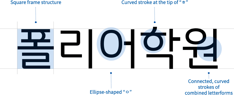
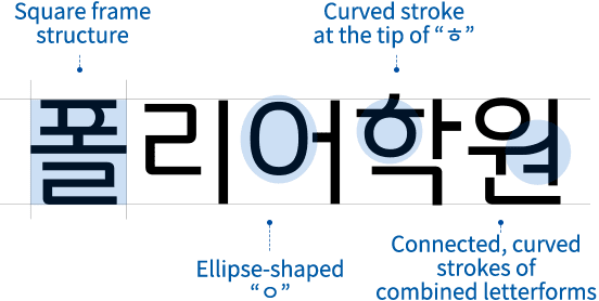
Pathfinder is a typeface derived from the renewed Poly logo,
combining the symbolic elements of the logo with font versatility.
It exudes a modern and stable aesthetic with clean curves and straight lines.
The Hangul characters have a stable, square proportion,
incorporating the curved characteristics of the logo
into their letter shapes
to achieve visual consistency between the logo,
the Latin alphabet, and the Korean alphabet.


Expressing a Multifaceted
Spectrum
With
Poly's Unique Color System.
While preserving the heritage of Poly's signature blue,
we've expanded the arrangement of complementary
sub-colors for added diversity.
